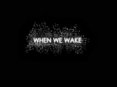
Here is the final title design for my short film 'When We Wake'. The use of the white 'ash' in the background of the title represents the fact that the teenagers within the film have survived a nuclear apocalypse, therefore ash will be falling from the sky; similar to snow. The font used for the title is effective because the story-line is quite bold and hard hitting same as the font being noticeable mirrors the films storyline and genre. The fade effects on the bold font as it looks out of focus, which also mirrors the state of Daisy within the opening sequence; slight fading of the font relates to the fading of the mind ( clouding of memories) which also links with the theme of awakening.
There were many thriller and science-fiction film titles that influenced our final title design. As a group, we looked at film titles that we have previously seen before within specific films that have similar narrative characteristics and focussed on the similarities and differences these titles shared i.e. majority of film titles within the science fiction and thriller genre are bold, slightly faded and each letter within the main film title are either extremely close together or spaced out equally.
One film title I thought would be a good example of thriller/science-fiction film title was 'Inception' by Christopher Nolan. The film title is simplistic yet suits the genre; having each letter within the word being evenly spaced suggests the idea of isolation or separation from one another. This is the exact theme my group and I were trying to achieve; even though we are together united as one group, we try our best to stay away from the enemy (separated from any other human being).Moreover, we feel alone in the way we have left our previous living conditions and lifestyle behind.
Another film title we looked at was Martin Scorcese's 'Shutter Island'. The elements of this film title that were used within our own title were the different shadings of one colour; in this case, the colour being grey. The use of the bold font for the film title makes it the dominant aspect at the beginning of the film.


